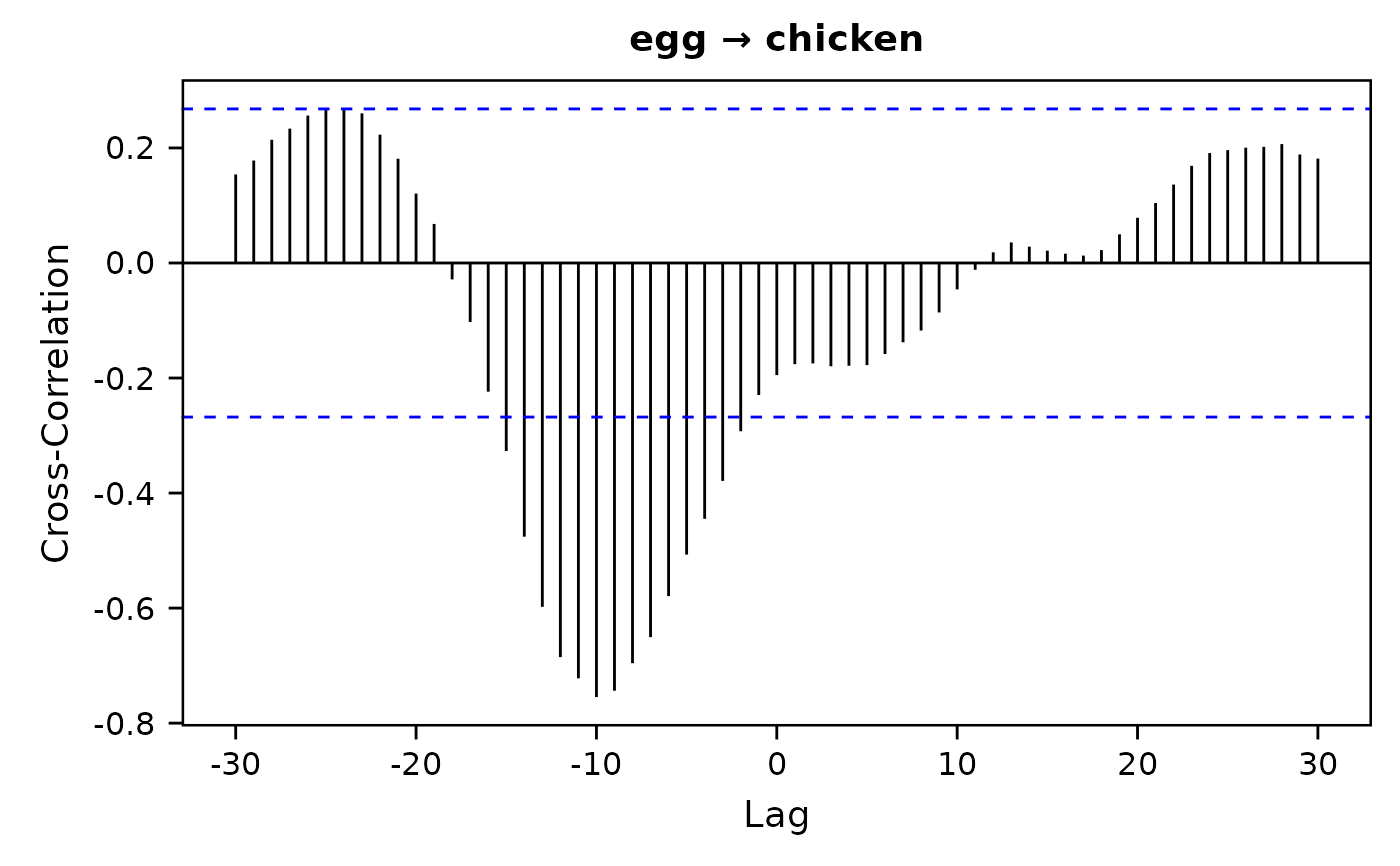
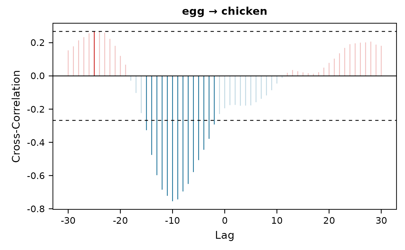
Plot the results of cross-correlation analysis using ggplot2.
Arguments
- formula
Model formula like
y ~ x.- data
Data frame.
- lag.max
Maximum time lag. Defaults to
30.- sig.level
Significance level. Defaults to
0.05.- xbreaks
X-axis breaks.
- ybreaks
Y-axis breaks.
- ylim
Y-axis limits. Defaults to
NULLto automatically estimate.- alpha.ns
Color transparency (opacity: 0~1) for non-significant values. Defaults to
1for no transparency (i.e., opaque color).- pos.color
Color for positive values. Defaults to
"black".- neg.color
Color for negative values. Defaults to
"black".- ci.color
Color for upper and lower bounds of significant values. Defaults to
"blue".- title
Plot title. Defaults to an illustration of the formula.
- subtitle
Plot subtitle.
- xlab
X-axis title. Defaults to
"Lag".- ylab
Y-axis title. Defaults to
"Cross-Correlation".
Value
A ggplot object, which can be further modified using ggplot2 syntax and saved using ggsave().
Details
Significant correlations with negative time lags suggest shifts in a predictor precede shifts in an outcome.